I love infographics. There aren’t many things that make me happier than when I get an email or phone call from a client saying “we need an infographic”. Ah, the joy…
All data is different and what we want to communicate with it will define our infographic and how we design it.
As much as I like to grab content and information and make it look more engaging, I love it when I receive a plain spreadsheet with lots of columns, rows and data… along with a note saying “can you help us communicate this better?”
It then becomes an exercise that I refer to as “finding the common denominators”. What is the data about? Is it about locations, about survey results, or maybe about how a business is planning to spread a project country-wide? How can I summarise this into a concise, easy to follow and memorable piece? So, then I start playing with these common denominators and I lay down the data.
So why do we do it?
Let’s break it down with a real project example, shall we?
Now, before I go on, I must mention that I am not disclosing the name of the clients and I have made all the content of my infographic generic. Suffice to say that it is a management consulting firm that, in turn, has a client who is a large public sector provider that operates at a national level.
So, in a nutshell, this organisation had some trouble making a decision about where their efforts and, more importantly, their budget should be focused. There were several departments in the organisation that operated slightly differently in each Australian State.
Because they couldn’t see eye to eye, they engaged my client to run a massive survey questionnaire across the leaders of the organisation. This generated lots of different results, and was looking like becoming a thick report with lots of plain looking data, which wouldn’t provide the engagement breakthrough they needed.
The process.
So this is how this happened:
I received all the responses compiled in one big spreadsheet. Luckily, these were already categorised in “problem categories”, so there was my first common denominator.
Then, I started looking for other ways to separate the data, and after reviewing the file for a bit, I separated everything by State and also by the organisation’s departments. I moved some columns and rows around and started to see some clarity.
The client’s trouble was that they could not agree about these problems… which one was the most crucial problem? Which state(s) had this problem? In what department? These questions helped me find further common denominators. And, once these were identified, I had to decide how the data would be displayed and what I would use to do so.
With most infographics, common denominators can be separated by location/structure, colour, shapes and other graphic elements. So I started with structure.
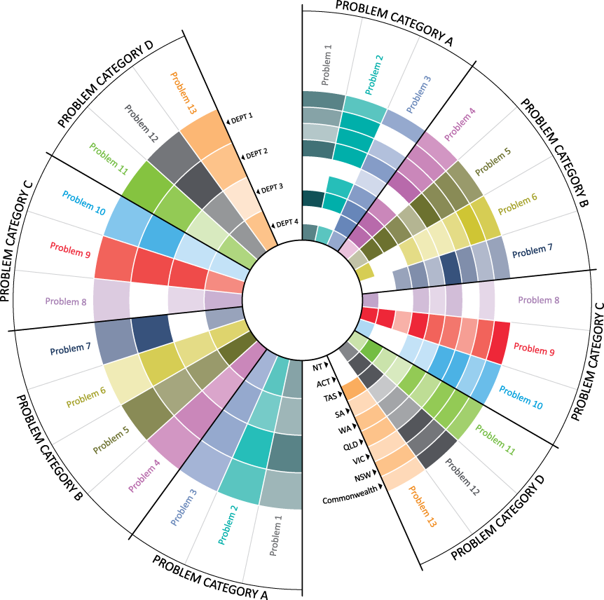
The biggest contrast in the data was the different numbers between states and departments, so I decided to mirror all the problems, separated in categories, from left to right. Then I moved into colour, using different hues for each problem. And finally, I changed the opacity of each of these colours depending on the ranking they were given by the survey results.
And here is the final product:

The beauty of this infographic is its simplicity. It displays what was written in over 100 pages of survey results in one glance.
My client invited me to the presentation of the findings. She started it by putting this image on the screen, which they also had as a large foldout with their reports. The report had all the problem categories and their responses displayed in the same colours. I must say, I was pretty proud to hear “oohs” and “aahs” and exclamations such as “now it all makes sense”. The infographic stayed on the screen for most of the session, while they discussed and came to agreements, planning on budget allocations lined up by categories and departments.
It all started with a spreadsheet.
Do you have data or information that you would like to display in a concise, easy to follow and memorable way? Would you like to see more infographic samples? Feel free to contact me or send me a private message via LinkedIn.
Until next time.

